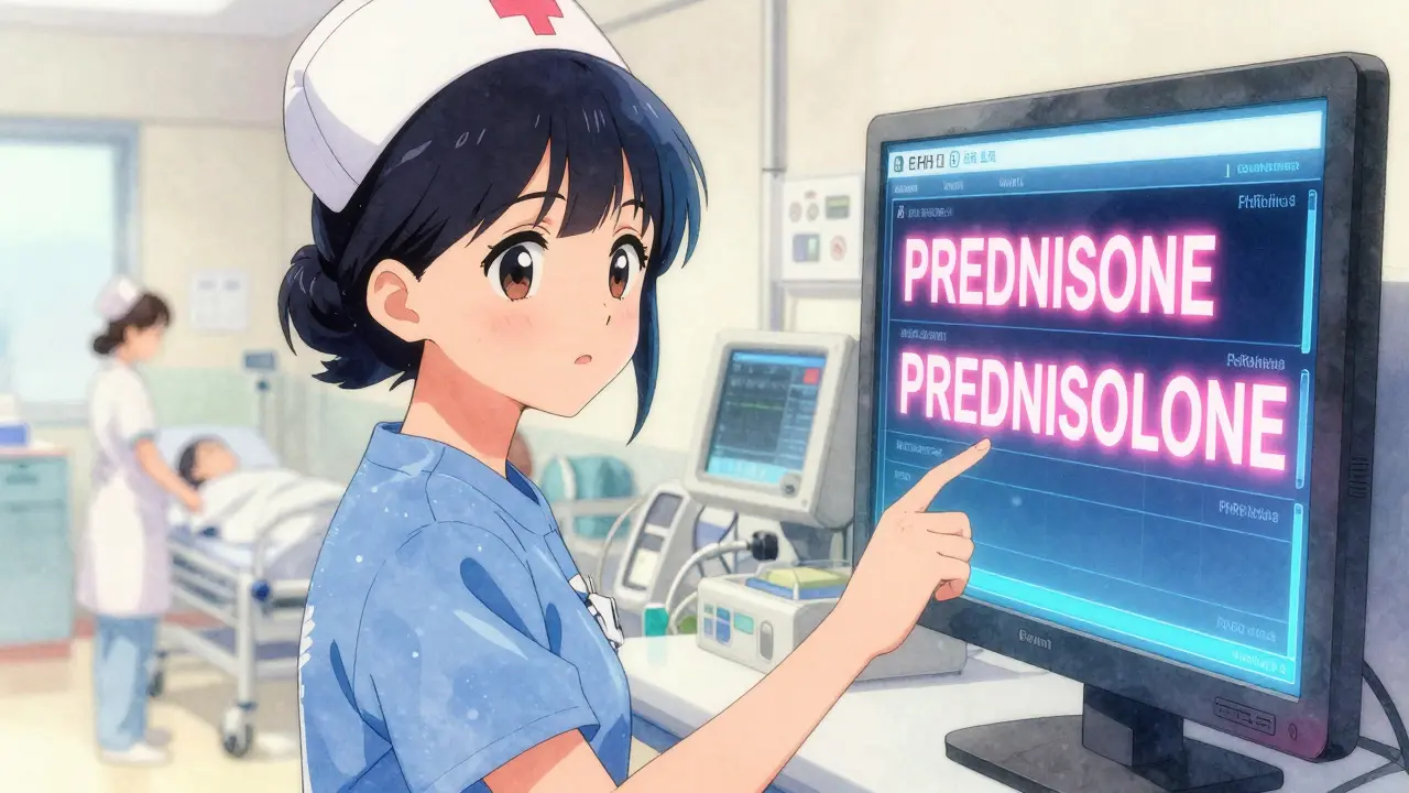
Every year, thousands of patients are harmed because two drug names look or sound too similar. Tall-man lettering is one of the simplest, cheapest tools hospitals and pharmacies use to stop these mistakes before they happen. It doesn’t require new machines, extra staff, or expensive software. All it takes is changing how drug names appear on screens and labels - using capital letters to highlight the key differences between look-alike, sound-alike (LASA) drugs.
What Tall-Man Lettering Actually Does
Tall-man lettering isn’t about making everything uppercase. It’s about selectively capitalizing the parts of a drug name that make it different from another. For example:
- PredniSONE vs. PredniSOLONE
- HydroMORphone vs. MorPHINE
- VinBLAStine vs. VinCRIS-tine
These aren’t random choices. The capitalized letters are the exact spots where the names diverge. When a nurse scans a medication or a pharmacist pulls a bottle off the shelf, their eyes snap to those uppercase letters - and instantly know they’re looking at the right drug. It’s visual shorthand that cuts through the noise of a busy unit.
The technique was first named by the Institute for Safe Medication Practices (ISMP) in 1999. Since then, the U.S. Food and Drug Administration (FDA) has officially endorsed it. Today, it’s built into electronic health records, automated dispensing machines, and prescription labels across most U.S. hospitals - and increasingly in Australia, New Zealand, and parts of Europe.
Why It Works - Even When Other Things Don’t
You might think: ‘If we have barcode scanning and double-checks, why do we still need this?’ The answer is simple: humans still make mistakes under pressure. In an emergency room, during a night shift, or while juggling ten tasks at once, your brain doesn’t process text the same way it does in a quiet office. When you’re tired, distracted, or rushed, your eyes skip over small differences - like a lowercase ‘e’ versus an ‘o’.
A 2004 ISMP eye-tracking study showed that when providers saw tall-man lettering, they made 35% fewer selection errors in simulated scenarios. That’s not theoretical. That’s real behavior change. Nurses and pharmacists reported that the capitalized letters acted like a visual alarm. One nurse practitioner said: “The ‘SONE’ in predniSONE tells me it’s not predniSOLONE - I don’t have to stop and think about it.”
It’s not perfect. Some studies, like one from 2016 analyzing 42 children’s hospitals, found no clear drop in error rates after implementation. But that study had a major flaw: it didn’t check whether the hospitals actually used tall-man lettering correctly. Many didn’t. Others used inconsistent patterns. When done right, the data supports it.
How It’s Done - The Rules Behind the Letters
There’s no single global standard, but there are widely accepted guidelines. The FDA and ISMP both publish lists of which drug pairs need tall-man lettering - and how to format them.
The FDA recommends starting the capitalization from the left side of the name where the difference appears. So:
- CISplatin vs. CARBOplatin
- HYDROmorphone vs. morphINE
ISMP, on the other hand, sometimes capitalizes differently. For example, they use HYDROcodone vs. oxyCODONE. This inconsistency is one of the biggest problems in practice. A pharmacist might see one version in their EHR and another on a label from the community pharmacy down the street. That confusion defeats the whole purpose.
As of 2023, the FDA lists 72 drug pairs requiring tall-man lettering. ISMP’s list is much longer - 252 pairs - and gets updated every quarter. Australia’s list has 192 pairs. The differences reflect real-world error reports: new drug combinations, new brand names, and new near-misses.
Implementation Isn’t Just About Typing
Putting tall-man lettering into your hospital’s system isn’t as simple as changing a font. It requires coordination across multiple systems:
- Electronic Health Records (EHRs) - like Epic, Cerner, or Meditech
- Automated dispensing cabinets (Pyxis, Omnicell)
- Prescription labels printed at the pharmacy
- Barcodes and inventory databases
A 2022 study in Pharmacology Research & Perspectives tracked a hospital that modified 210 drug names across 13 systems. It took 16 weeks - and a dedicated team. You need IT staff who understand medication safety, pharmacists who know which drugs are risky, and administrators who prioritize safety over convenience.
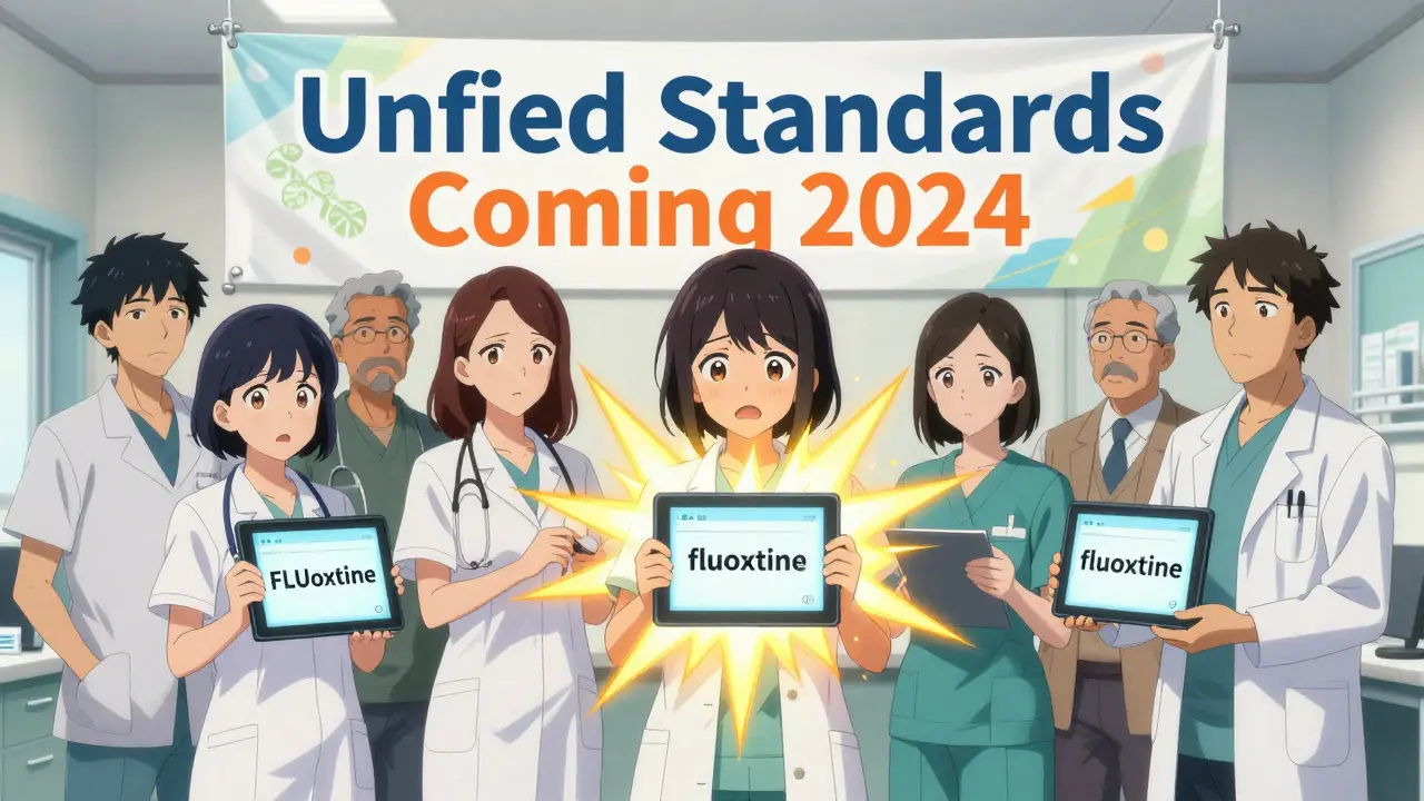
Common roadblocks? Legacy systems that don’t support custom capitalization. Vendors who don’t update their software consistently. Staff who think “we already have barcode scanning, so this isn’t needed.” The biggest issue? Inconsistency. If your hospital uses “FLUoxetine” but the pharmacy down the road uses “fluoxetine,” you’re creating confusion instead of preventing it.
What the Experts Really Think
Not everyone is convinced. Dr. Robert Wachter, a leading patient safety expert, argues that tall-man lettering gives a “false sense of security.” He believes forcing functions - like systems that block you from selecting the wrong drug entirely - are more effective.
But most experts agree it’s a necessary layer, not a complete solution. Dr. Michael Cohen of ISMP says: “It’s not a panacea, but it’s one essential layer in our defense-in-depth approach.” The American Society of Health-System Pharmacists (ASHP) gives it a Grade B recommendation - meaning the evidence supports it, but it’s not enough on its own.
And here’s the thing: it costs almost nothing. A 2021 study in Australia found the average cost to implement tall-man lettering across a hospital system was just AU$1,200. Compare that to the cost of a single medication error - which can run into tens of thousands of dollars in legal fees, extended hospital stays, and lost productivity.
Real Stories From the Front Lines
Pharmacist Maria Chen at a large Midwestern hospital says: “After we implemented ISMP’s tall-man lettering in our Epic system, we saw a 42% drop in overridden alerts for LASA drugs in six months.” That’s not a guess. That’s data.
But not all stories are positive. Physician John Davies posted on Reddit: “I constantly mix up ALPRAZolam and LORazepam in our EHR. The tall-man letters are too small. The font’s too thin. I can’t tell the difference unless I zoom in.”
That’s the catch. Tall-man lettering only works if it’s visible. If your screen uses a tiny font, or if the capitalized letters are washed out, it’s useless. Some hospitals fix this by increasing font size, using bold, or even adding a subtle background highlight to the capitalized portion.
Another common complaint? “Our Cerner system uses PARoxetine, but our Pyxis machine shows fluoxetine. The community pharmacy uses something else.” That’s not safety - that’s chaos.
What’s Next? AI and Standardization
In January 2023, the FDA and ISMP announced a joint effort to unify their tall-man lettering lists. The first combined list is expected in mid-2024. That’s huge. If every system - from Epic to your local pharmacy - uses the same capitalization, the risk of confusion drops dramatically.
Some hospitals are already testing AI-enhanced versions. Epic is piloting a system that learns from real-time error data. If users keep selecting the wrong drug despite tall-man lettering, the AI adjusts the capitalization pattern to make the difference even clearer. Early results show a 29% greater reduction in errors than standard tall-man lettering.
Still, experts agree: tall-man lettering won’t disappear anytime soon. Even as voice recognition and AI prescribing tools grow, humans will still need to read, verify, and confirm. And when they do, they need clear, immediate visual cues.
How to Use It Right - Best Practices
If you’re implementing or using tall-man lettering, here’s what works:
- Use the latest ISMP or FDA list - don’t rely on outdated versions.
- Apply it consistently across every system: EHR, dispensing machines, labels, and printed sheets.
- Use bold, readable fonts. Avoid thin or condensed typefaces.
- Train staff not just on what it is, but why it matters. Show them real examples of near-misses.
- Monitor for inconsistencies. If one system uses “HYDROmorphone” and another uses “hydroMORphone,” fix it.
- Don’t stop at tall-man lettering. Combine it with barcode scanning, double-checks, and clear communication.
It’s not magic. But it’s one of the few safety tools that costs almost nothing and works every single time - if done right.
What does tall-man lettering mean?
Tall-man lettering is a technique that uses selective capitalization in drug names to highlight the differences between look-alike, sound-alike (LASA) medications. For example, writing "predniSONE" and "predniSOLONE" helps healthcare workers quickly tell them apart, reducing the chance of giving the wrong drug.
Which organizations recommend tall-man lettering?
The U.S. Food and Drug Administration (FDA), the Institute for Safe Medication Practices (ISMP), and Australia’s National Mixed-Case Lettering List all officially recommend tall-man lettering. The Joint Commission also requires healthcare organizations to use methods like this to prevent medication name confusion.
Does tall-man lettering actually reduce errors?
Yes - when implemented correctly. Studies show a 35% reduction in selection errors in simulated environments. Real-world data from hospitals using consistent, well-designed tall-man lettering show drops of 30-42% in LASA-related alerts. However, if the capitalization is inconsistent or hard to read, the effect disappears.
Why do some systems use different capitalization patterns?
Different organizations - like the FDA and ISMP - have historically used slightly different rules for which letters to capitalize. This has led to confusion, especially when a hospital uses one pattern and a pharmacy uses another. A joint FDA-ISMP initiative launched in 2023 aims to unify these standards by mid-2024.
Can tall-man lettering replace barcode scanning or double-checks?
No. Tall-man lettering is a visual aid, not a safety barrier. It works best when combined with other tools like barcode scanning, independent double-checks, and electronic prescribing alerts. It’s one layer in a defense-in-depth strategy - not the only one.



Comments (9)
Sarah Mailloux
I used to work ER nights and this saved my butt more than once. PredniSONE vs predniSOLONE? Yeah I used to grab the wrong one till I saw the caps. Now I just glance and go. No thinking needed.
Nicholas Urmaza
This is basic safety 101 and yet hospitals still fight it like it's a tax. If you can't spell out the difference in the name then you don't deserve to handle meds. End of story.
Nilesh Khedekar
In India, we don't even have this... and yet somehow we don't kill people every day. Maybe the real problem is overmedicating? Or maybe we just don't have enough drugs to confuse? Or maybe... we're just better at listening to patients?
Jami Reynolds
You know who pushed this? Big Pharma. They want you to think the system is safe so you stop asking questions. The real issue? They keep releasing drugs with names that are too similar on purpose. It's a trap. And now you're celebrating the band-aid.
Amy Ehinger
I work in a small clinic and we started doing this last year and honestly? It's been a game changer. We had this one nurse who kept mixing up hydromorphone and morphine-like, every other week. After we switched to HYDROmorphone and MORPHINE, she said she could tell the difference even from across the room. It's not fancy, it's not expensive, it's just... smart.
RUTH DE OLIVEIRA ALVES
The implementation of tall-man lettering represents a paradigmatic shift in pharmacovigilance protocol, aligning with the principles of human factors engineering and cognitive load reduction. It is imperative that standardization across jurisdictions be harmonized under the auspices of international regulatory bodies to ensure fidelity and efficacy in global healthcare delivery.
Nat Young
35% fewer errors? That’s a study with a biased sample. My hospital tried it and errors went up because people started ignoring the caps thinking they were just marketing. And don’t even get me started on the 2016 kids’ hospital study that got ignored because it didn’t fit the narrative.
Niki Van den Bossche
Tall-man lettering is not merely a typographical adjustment-it is a metaphysical assertion of linguistic clarity in an age of ontological decay. We have allowed language to become a playground of corporate entropy, and now we slap capital letters on it like a spiritual incantation to ward off the ghosts of misprescription. The real tragedy? We still believe a font can save us from our own negligence.
Diane Hendriks
This is why America is falling apart. We spend millions on capital letters while our roads crumble and our schools teach gender theory. We care more about how a drug name looks than whether a child has clean water. This isn't safety-it's performative virtue signaling dressed up in Helvetica.